ESReality - Where Gaming Meets Reality
Not Logged In | Login | Register
07:59 CST - 1544 users online
All Posts
Smoothing test (61 comments)
Posted by »bst @ 23:16 CST, 4 November 2014 - iMsg
I'm curious about this whole smoothing phenomenon, so I thought of a test. I want to see if theres as much of a difference as stated by the people who say smoothing is interfering with flick shots and so on.

So all you have to do, is go to this site:
http://www.aimbooster.com/
And click on "Challenge"

Just do your best, take a screen shot, and write down what mouse you used.

RULE 1: don't take part in the test if you've just switched mice or surface, you need to have been using the same set up and feel comfortable with it for about a month at least. I don't want the test to be polluted with other factors like not being used to the shape or glide.

RULE 2: you can only post one result (you can practice at the game first though so you can post your best result). I don't want this to go on forever, and people submitting a result every time they get 1% more accuracy. So make it count...

As the test goes I'll score mice that are reported to have smoothing against mice reported not to have smoothing. So its kind of a fight to see who wins.

Obviously its not a perfect test, but it'll still be interesting to see the results if enough people participate. Its light hearted so don't take it too seriously, its just a bit of fun :)

Also this is the theme tune you should be thinking of when on this page: https://www.youtube.com/watch?v=jei89Moq4l0
Edited by »bst at 19:41 CST, 5 November 2014 - 27080 Hits
NEW GAMING MOUSE DEVELOPMENT (PART 3) (1522 comments)
Posted by »bst @ 04:22 CDT, 21 October 2014 - iMsg
Continued from here: http://esreality.com/post/2487925/new-gaming-...nt-part-2/

If you have a new post to make please post it here instead of the old thread.

Latest news and info:

I should be receiving stock Early-mid Nov 2014
Its on track, there may be a delay for something I haven't anticipated but there shouldn't be anything too bad, hopefully none at all.

What products are being released?

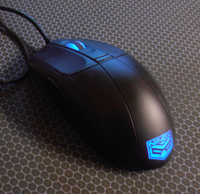
- The Ninox Aurora mouse, which was developed with the feedback and suggestions from users in this thread. Please see below for specifications.

How to keep updated

The best place is the facebook page, which I will be updating from now on:
https://www.facebook.com/ninoxtech

Twitter:
https://twitter.com/ninoxtech

The Ninox website:
www.ninox.org

And of course this thread, but it is harder to keep track of. There is also a problem with me advertising the pre-orders on this thread - ESR doesn't encourage self-promotion of products. So to keep track of Ninox products, in the fullest way possible, its best to use facebook ("Like" the page with full updates).

Specifications and photos of the Ninox Aurora

Photos:
Click here to see photo gallery
(Please note these are outdated photos, but the shape remains the same. The main difference is that on the final version, the logo glows, and the sides are no longer transparent).

Software

- Required OS: Windows 2000 / XP / Vista / 7 / 8
- Installation not required, but recommended on first use in order to configure the mouse, then can be uninstalled if desired

Software user guide (shows screenshots):
http://ninox.org/files/Ninox_Aurora_User_Manual.pdf

Specifications:

Sensor/Firmware:
- Model and type: ADNS-3090, 4000 DPI SROM (No angle snapping), LED Optical
- Location and orientation: Exact centre, standard orientation (not rotated 90 degrees)
- Lens: Standard Avago Lens
- DPI steps: 400 / 800 / 1600 / 3200 / 4000
- LED: High quality infra-red (invisible to the human eye)
- Lift off distance: ~2mm
- Max speed: Over 160 IPS
- USB Hz: 125 / 250 / 500 (default) / 1000hz

Switches:
- Left and right click: Omron D2FC-F-7N(10M)
- Scroll Wheel: Omron D2FC-F-7N(10M)
- All other buttons: Huano White 3M

Scroll wheel encoder:
- Mechanical, made by TTC, 24 distinct steps, quiet operation

Shell:
- Size (LxWxH): 118 x 61 x 38 mm
- Weight: ~70g (without cord)
- Side buttons: Two, on left side only (two side buttons in total)
- Top buttons: One, behind scroll wheel (assigned to DPI switch by default)
- Top part of the shell: Rubber coated ONLY (glossy version has been cancelled for now)
- Bottom half of the shell: Uncoated/unpainted grainy plastic
- Scroll wheel: Transparent plastic with black rubber insert
- Construction: Clips on at the front, one screw at the back of the mouse, no screws underneath the mouse feet

Cord:
- 2.2 meter flexible rubber cord
- Strong internal wires
- Plugged into PCB not soldered directly
- Stress relief for cord (where it attaches to the mouse)
- Photos comparing ultra-flexible cord with normal rubber cord:
Cord photo 1
Cord photo 2

Price
29.99 GBP
49.99 USD
37.99 EUR

Reviews

Coming soon

What about the "Velocity" mouse and the A3050 sensor?

At the moment both of these are on hold. The decisions were made because:
- The A3050 is not worth the small saving over the A3090 because its simply not as good.
- The Velocity shell, while nice, is OEM, and I would prefer to move away from OEM shells ASAP, simply because they aren't as stylish or as customisable as I would like the future products to be.

I heard you can modify the WMO to use the Aurora PCB, is there more information about this?
Yes, you can do that. It does void the warranty and it isn't officially supported, its more something that I personally found and shared. I will post a video guide when I get a new rotary tool. Overall its a fairly easy modification to do, there are no special skills needed (like soldering), just some grinding away of plastic and some application of glue/putty.
Update: I found the tool! So I made another one and recorded it:
http://i.imgur.com/4MWgCyG.jpg
http://i.imgur.com/ESWGunN.jpg
http://i.imgur.com/WUFCZYh.jpg
http://i.imgur.com/5EyRtvG.jpg
Edited by »bst at 07:41 CST, 6 November 2014 - 776224 Hits
Edited by »bst at 04:27 CDT, 21 October 2014 - 589428 Hits
Videos of my map updates (44 comments)
Posted by »bst @ 09:36 CDT, 14 September 2013 - iMsg
I posted these vids in the Delirium feedback thread, but no_il suggested
that I make a new thread for them. They show the changes I have made to Terminatria and Delirium which will be coming very soon in QL.

Sorry these vids aren't great but its the first time I've uploaded QL vids, I'll make them better next time! There isn't much time at all to make any more changes, unless they are really tiny, but its just so that you can get an idea of what to expect:


Delirium changes:
- Added 3x25hp
- Added 2 extra spawns for duel, and another 2 more for TDM/FFA
- Added elevator to lower YA area
- Fixed LG->RA teleporter not working in TDM
- Replaced stairs with elevators at RA and MH areas
- Opened up lower RA area
- 2-way teleporter at RA changed to 1-way
- Lower YA teleporter now exits at upper MH
- New teleporter in mid which exits at the old YA teleporter exit
- Some areas re-made for a cleaner / different look
- Weapon clip added to bumpy ground to increase effectiveness of rocket splash damage
- Lots of small tweaks to make the map faster and more fluid


Terminatria changes:
- Multiple texture and clipping fixes
- Performance improved
- Duel mode made smaller, with item layout changes to suit

I don't know why but delirium came out really dark, its much brighter in game.

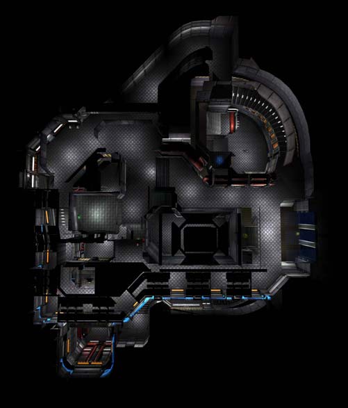
Also here is a new duel map I have been working on, its working title is Heatwave (because when I started its "skeleton", it kind of looked like a mirror flipped version of Monsoon from Q4 (and a heatwave is the opposite of a monsoon...), but now its not so much like it, though you can still kind of see it at the RG/YA room), hopefully it'll get into Quake Live. I want to try some things with the MH/YA area, not sure if its as good as it can be. Any ideas/feedback would be appreciated :)


Screenshots: http://imgur.com/a/tWPu3#0
Edited by »bst at 11:23 CDT, 17 September 2013 - 14774 Hits
terminatria ideas (52 comments)
Posted by »bst @ 04:36 CST, 2 January 2013 - iMsg
I guess Terminatria has been played enough now for feedback, so feel free to post your ideas below. I really want to find out what are the most popular things which people would like.

Two things I know of are:
- Needs more hp (but I don't know where you'd like it)
- Can see through a wall in mid

So if you let me know what you'd like, I will see if I can change some things (please try and post a screenshot to make it easier to explain). Also please let me know if you think the changes should be for duel or TDM.

I don't think there can be any major structural changes, but extending some ledges, and maybe blocking off a room for duel mode could be ok, and ofc item changes are ok.

Thanks :)
Edited by »bst at 04:36 CST, 2 January 2013 - 13217 Hits
Ninox mouse mat (+ competition) (155 comments)
Posted by »bst @ 01:55 CST, 13 December 2012 - iMsg
While the mice are being developed, I have also been working on a mouse mat. Here are the planned specifications:

Material: Cloth with rubber base
Type: low friction / speed
Size: 450-500mm x 350mm x 4mm
Packaging: flat (not rolled up)
Edges: High density stitching
Logo: Dyed in, not sprayed on

Also its not confirmed yet, but the base might be two layers. The base would be 2mm soft rubber, and the top would be 2mm harder rubber (higher density), so you get a bit of softness so your wrist is comfortable, and the surface is harder so your mouse feet don't sink in too much and cause too much friction.

Its designed mostly for sensors with the A3090 and A3050 optical sensors on the Aurora and Velocity, so some specifications may change in order to increase performance.

The colours I was thinking of were:
- black (or dark grey)
- white (or light grey)
The grey is really just to be different, it depends how well it works with the sensor though.

At the moment I'm just getting it in black, to test the surface material and overall quality. If its good then I'll get more colours and do a small test.

Here is a photo of the mat (sorry its not the best quality, better ones with closeups will be coming really soon):
http://ninox.org/images/ninox-mat1.png

Here is some design ideas with the logo position and style I was thinking of:
http://ninox.org/images/ninox-mat2.png
There is a background on those pics, but they may not make it into the final versions because the A3090 can sometimes be picky about colour changes in the surface, but if theres not too much contrast it probably won't make any difference (will be tested though).

As always, let me know what you think and any ideas and opinions you have!

-------------
COMPETITION
-------------

I thought I'd let the ESR community come up with a name for the mat, so if you have one in mind, post it in this thread and you'll be automatically entered into the competition. The winning name will be chosen by me. I was going to say whoever gets the most plusses, but I know ESR a bit too well haha, No product is going to be called the Ninox "Jamerio = virgin". OK!? ;)
(for those who don't know what I'm talking about, I'm refering to this: http://www.esreality.com/post/1252609/entry-36/ ).

The winner will receive the mouse mat for free when its finished, Also it may be possible to customise it a bit (eg have your game tag on it), but can't promise it just yet (will let you know).

The competition ends when a name is chosen, but there will be a couple of weeks to let people see the thread and come up with one.
Note: If two people say the same name, the person who said it first wins. Also, links are not valid entries, the actual names you want entered into the competition have to be in the post (otherwise its too hard to verify who said which name first).
Edited by »bst at 17:49 CST, 14 December 2012 - 42360 Hits
Interesting contrast :) (2 comments)
Posted by »bst @ 20:19 CDT, 2 August 2012 - iMsg
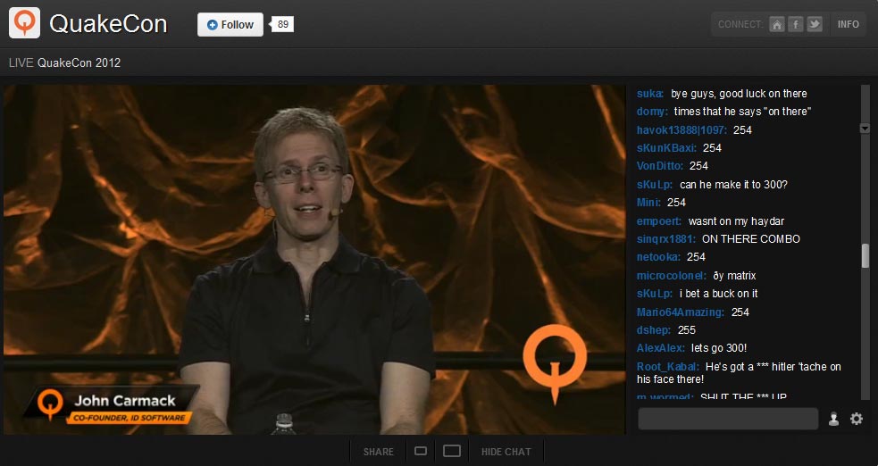
John Carmack talking about high brow things, meanwhile in the chat....

[img1]
image

O_o
1323 Hits
New gaming mouse development (2755 comments)
Posted by »bst @ 00:24 CDT, 26 October 2011 - iMsg
Edited by »bst at 21:32 CDT, 4 October 2013 - 1289612 Hits
windows aero mouse pointer (26 comments)
Posted by »bst @ 00:27 CDT, 16 July 2011 - iMsg
I was having some problem with my mouse, when I tried to move it in a horizontal line on the screen it kept going at the wrong angle, like it would go down or up too much (not by a huge amount but enough to notice, seemed a bit random though).

I thought it was my new mouse and its sensor position / firmware calibration or some shit, and thought I'd just get used to it. But no, I didn't get used to it and it was starting to piss me off. So anyway I looked this kind of thing up on the net and found... stuff... anyway from that stuff I found out the windows 7 / vista aero pointers can mess with your mouse in strange ways. So, I went into the windows mouse settings and set the pointer scheme to "none" and it fixed it...!

I don't know if its specific to my mouse (roccat kova+) or anything, I heard something about graphics card drivers.. but whatever. I don't trust the aero pointer scheme anymore.

This even affected ql btw, even using in_mouse 2.

So if you have this problem then try that, it could be your solution :)
7520 Hits
My maverick mapping comp map (alpha 2) (No comments)
Posted by »bst @ 18:46 CDT, 1 July 2011 - iMsg
Just thought I'd post my entry for the maverick mapping competition here, since I am about to begin texturing, would be nice to get some feedback before it gets too far along :)

Its meant for FFA/TDM/CA and maybe duel, and is a similar sort of shape to DM6.

I'm mostly looking for feedback on gameplay, ie: layout/items/movement etc.

click here to dl

Cheers :)

Screenshots:

http://img199.imageshack.us/img199/8352/20110702004740948.jpg
http://img706.imageshack.us/img706/8453/20110702004755075.jpg
http://img194.imageshack.us/img194/1221/20110702004803625.jpg
http://img220.imageshack.us/img220/182/20110702004820999.jpg
http://img687.imageshack.us/img687/1772/20110702004828897.jpg
http://img696.imageshack.us/img696/3049/20110702004841885.jpg
http://img844.imageshack.us/img844/8467/20110702004847254.jpg
Edited by »bst at 18:52 CDT, 1 July 2011 - 1196 Hits
more info on accel options (7 comments)
Posted by »bst @ 14:36 CDT, 2 June 2011 - iMsg
I don't really know how these new options work, and haven't found anywhere that really explains it, so I'm hoping someone on here knows. This is what I've got so far, but there are big gaps in my knowledge of how it works -

cl_mouseaccel - this takes the square root of mousespeed_x^2+mousespeed_y^2 then it multiplies that number by cl_mouseaccel value and adds it to your sens?

cl_mouseaccelpower - allows you to set the exponent (z) ie: mousespeed_x^z + mousespeed_y^z, making it so the number that is multiplied by the cl_mouseaccel value increases at a faster or slower rate?

cl_mouseacceloffset - what does the value represent? If I put in 2, what is it 2 of? I assume its some kind of speed rating. I guess it takes the number that is multiplied by cl_mouseaccel and does something with that?

tbh I don't really have too much trouble finding a nice setting, but was just curious how it really works in the game code.
Edited by »bst at 14:38 CDT, 2 June 2011 - 11988 Hits
tdm map (38 comments)
Posted by »bst @ 20:11 CDT, 21 April 2011 - iMsg
Recently I've been making some tdm map layouts, but I'm unsure if what I'm making is any good (ie, worth finishing). I think they are pretty good but I haven't played TDM in a long time, so I could be missing some really important things.

I've uploaded one of my favourite maps and would really appreciate it if some experienced tdm'ers could take a look and let me know any comments or suggestions.

I done a lot of research on trying to find out what tdm'ers want from a map, on this one I wanted to make a combination of style between deep inside and grim dungeons, while also adding/removing things that people wanted changing about those maps. The graphics are obviously nothing special but its like that to keep it easy to modify. Also you will notice theres 3 YAs, I know thats overkill, but they're just marking where I think armours could be nice.

If people really don't like it I will upload one of my other ones in a different thread ;)

Thanks!

download map here

Instructions:
Extract to:
id Software\quakelive\baseq3
Start a practice game, bring down the console and type
map bst5a1

Screenshots:
http://img703.imageshack.us/img703/9172/shot0967.jpg
http://img847.imageshack.us/img847/9109/shot0964.jpg
http://img97.imageshack.us/img97/127/shot0963.jpg
http://img684.imageshack.us/img684/2461/shot0962.jpg
http://img810.imageshack.us/img810/5714/shot0941.jpg
http://img824.imageshack.us/img824/2506/shot0940.jpg

Also if anyone is interested, here is the original drawing xD
http://img705.imageshack.us/img705/5998/bst5.jpg
Edited by »bst at 20:39 CDT, 21 April 2011 - 6323 Hits
QL FFA (51 comments)
Posted by »bst @ 10:07 CDT, 16 March 2011 - iMsg
I know this will sound trivial and maybe even wrong, but FFA in QL is lacking imo. And its the main mode which new people play, and its probably the worst main mode, in terms of how its had very little changes to improve it (except the maps ofc).

Its fair enough to make changes to duel, but those changes also apply to FFA, where they may not work so well...

The main problem in FFA is it seems to encourage more frustrating situations (compared with all other quake FFA I have played) -

- It takes too long to frag people even when you get high acc (which means noobs deaths are drawn out). What usually happens is what may be favourable to duel - they are bounced/pushed around for 'ages' - then somoene random finishes them off (frag stealing). No one enjoys any of that. The frag stealer gets no satisfaction, the attacker is left frustrated, and the attackee feels like crap. Also, because you often have to chase people down, there will nearly always be someone behind you shooting you in the back with mg (which wouldn't be a big problem if all weaps except mg were stronger).

- too hard to dodge in close combat (slow run speed + fast rockets with loads of bouncing).

- weapons respawn too slow, encouraging camping

- players respawn too slow (coupled with long drawn out deaths and slow weap respawn makes the time available to get a frag quite small for a noob)

- Quad introduces a huge random element

- too much ammo on weapon pickups = too much spam

IMO FFA needs some tweaks, something like:

- Make quadless servers available (replace quad with haste: At least give people the option, most people (especially noobs) HATE quad in FFA.)
- Increase weapon damage for all guns except mg, gauntlet, bfg, gl
- lower bounce on RL and knockback on LG
- Increase player run speed to Q4 speed
- lower weapon respawn times and player minimum respawn times
- change weapon ammo amounts on 2nd pickups

FFA should be fast and fun!! Its not terrible atm but its not as good as it could be IMO. But its not just my opinion, but most people's opinion who I've asked in the past few months. But maybe we are all wrong, but it would be nice to at least try some new things.

The larger hitbox has just made things worse, because it was already hard to dodge, consider that ql is one of the hardest quake games to dodge in.

The biggest problem is that in ffa, theres too much chipping away at peoples health, players die a lot but its very random how they die (ie more random than the other quakes were). Instead of having a fight to the death, what happens is players get seperated and die elsewhere, have to wait to spawn, then have to wait for a gun and usually get spawn killed (but SLOWLY not fast, which wouldn't be as bad).

FFA is what gets a lot of people into quake (along with CA maybe), which in turn makes them eventually try duel, see some nice games, and decide to try and become a good player. So whereas everyone seems to kind of ignore FFA as if its a stupid pointless mode, I think its really important and it needs a good look at, to see if people (new ones especially) are having as much fun as they should be having.

Maybe I am 100% wrong, but no one even seems to discuss FFA, so thought it would be good, at least for a change ;)
Edited by »bst at 10:11 CDT, 16 March 2011 - 14109 Hits
Request: ESR Mapping Forum (8 comments)
Posted by »bst @ 15:03 CST, 24 February 2011 - iMsg
I think it would be nice to have a forum dedicated to mapping, covering all games. I just think it makes more sense to keep those threads in their own section (mostly just for organisational perposes, ie. after you test a map, maybe leave it for a few days.... its easy to find the map thread again, or maybe even after a few months even).

I know if you have a map under the quake 3 forums people know straight away what game the map is for, and more people who play that game are likely to see it instead of going into the mapping forum. But I think if there was a mapping forum people would just put the game in the topic, and if not getting enough looks at their map they can just announce it in the respective game forum (I think a lot of people just look at the "all forums in one" though don't they?). And also it won't be pushed to the bottom so fast.

I know theres other mapping sites out there, but on ESR there are usually more players than mappers, and vice versa. So it does fill a gap in the mapping community and I think its important (it has been to me anyway).

So I'm just wondering what peoples opinion on it is (and any better ideas), and from the admins, if its a possibility?

Cheers
3810 Hits
My maps news + TDM map ideas (58 comments)
Posted by »bst @ 07:46 CST, 15 January 2011 - iMsg
Just thought I should let people know, I have been in contact with id and Syncerror said he'd like to get both my duel maps into QL. There isn't anything definate yet though. I am working on them still, but what I really want is to get them into QL for play testing. Since thats going to take a while, I have time to make another map, and I want to do a 4v4 TDM one.

So, this is like a research post really, I want to know what the main things are people are looking for in a new TDM map.

eg:
What are some major dos and don'ts for a TDM map?
What are the best TDM maps I can look at for inspiration?
Is there anything lacking from current TDM maps which you would like to see?

Also what is the basic flow of a TDM map and what kind of areas are necessary? I.e. how much help do I give to the losing team?

I think that quad should be accessible from both sides of the map and put the person grabbing it in a difficult situation. Is that right? Or is there more to it than that?

What do people think about the connections, eg in the map Retribution, each room is connected by an L or S shape. This can lower the r_speeds quite a lot ( =better performance). So in turn the map can be prettier. But it makes it harder to move around since there are more, and longer choke points, and it also makes the map larger/slower etc. But perhaps more strategic.

Final thing is, how do teams like to play a map - do you want it so the teams have to spread out to get control, or can control from a focal point? Or sort of a mix between both?

Sorry for the TL;DR post, and I know the questions are very noob. But I want to get as much good info as possible from the ground up. So I might think I know the answers to all my questions, but I don't want to get some stupid basic thing wrong :P

Thanks for reading and I look forward to hearing peoples ideas :)

Edit: links to my duel maps:
Delirium: http://www.esreality.com/index.php?a=post&id=1973510
Bst2 (working name): http://www.esreality.com/?a=post&id=2000185
Edited by »bst at 10:32 CST, 20 January 2011 - 11534 Hits
bst2 1v1 map (beta 3 update) (89 comments)
Posted by »bst @ 16:22 CST, 10 November 2010 - iMsg
Whoot... beta3...

Lots of changes/updates, too much to remember. But in brief:
- improved graphics
- "back" area expanded and new corridor made
- new teleporter at MH
- tons of tweaks to jumps, improved flow
- added another GA

I can't remember how much difference there is between this and beta 2, but its a lot (basic layout and items aren't really changed much though).

Things still to do:
- Improve lighting
- bit more clipping
- optimising
- textures, finish details
- some more tweaks to jumps ;)
(so nothing much really)

You may find the map a bit overloaded with "features" like trick jumps etc. I like it, but if people think its too much, I can remove things.

Still got no name... suggestions welcome xD

Hope you enjoy it and all (constructive) comments welcome!

Download map here

- Instructions:

Windows 7 & Vista
-----------------
Extract bst2_b3.pk3 to:
%userprofile%\AppData\LocalLow\id Software\quakelive\baseq3 (you can put this straight into the path and it will find it for you)
(eg: C:\Users\russell.GNET\AppData\LocalLow\id Software\quakelive\baseq3 )

Load up Quake Live in a pratice match, bring down the console, and type:
devmap bst2_b3

Windows XP
----------
Extract bst2_b3.pk3 to:
%appdata%\id Software\quakelive\baseq3 (you can put this straight into the path and it will find it for you)

Load up Quake Live in a pratice match, bring down the console, and type:
devmap bst2_b3

Screenshots:

http://img715.imageshack.us/img715/4685/shot0710.jpg
http://img141.imageshack.us/img141/5159/shot0709.jpg
http://img852.imageshack.us/img852/596/shot0708.jpg
http://img683.imageshack.us/img683/7338/shot0703.jpg
http://img97.imageshack.us/img97/4507/shot0701i.jpg
http://img641.imageshack.us/img641/1884/shot0699.jpg
http://img35.imageshack.us/img35/5468/shot0696y.jpg
http://img23.imageshack.us/img23/4123/shot0693p.jpg
Edited by »bst at 06:36 CST, 9 March 2011 - 25617 Hits
Delirium 1v1 map (new 20/07/11 - beta 5) (95 comments)
Posted by »bst @ 11:22 CDT, 6 October 2009 - iMsg
Beta 5
I've mostly been working on aesthetics and clipping, done some more play testing and made a few little tweaks. Mostly I thought the lighting could be better and there were some areas I thought didn't look as good as I wanted. Pretty much just twiddling with it lol. But might as well.

I wish I knew more about whether it will be in ql but I know about as much as anyone else :( Its a shame because it really is a nice map to play. Personally I LOVE this map lol, not just because I made it but because I really enjoy playing it!

BTW I call it a beta but its basically final, I can't think of anything left to do on it.. maybe put quad in for 2v2... only tiny things like that. But if anyone still has some suggestions feel free :)

---------------
DOWNLOAD HERE
---------------

New screenshots:

http://img20.imageshack.us/img20/6811/shot1168.jpg
http://img52.imageshack.us/img52/7872/shot1166.jpg
http://img846.imageshack.us/img846/5282/shot1165.jpg
http://img228.imageshack.us/img228/2410/shot1164.jpg
http://img121.imageshack.us/img121/6707/shot1163.jpg
http://img18.imageshack.us/img18/3584/shot1162.jpg
http://img829.imageshack.us/img829/9738/shot1161.jpg
http://img10.imageshack.us/img10/9274/shot1160.jpg
http://img146.imageshack.us/img146/6841/shot1159.jpg


Cheers
-----------------

Instructions:

Windows 7 & Vista
-----------------
Extract delirium_b5.pk3 into:
%userprofile%\AppData\LocalLow\id Software\quakelive\baseq3 (you can put this straight into the path and it will find it for you)
(eg: C:\Users\russell.GNET\AppData\LocalLow\id Software\quakelive\baseq3 )

Load up Quake Live in a pratice match, bring down the console, and type:
map delirium_b5
Or for cheats:
devmap delirium_b5

Windows XP
----------
Extract delirium_b5.pk3 into:
%appdata%\id Software\quakelive\baseq3 (you can put this straight into the path and it will find it for you)

Load up Quake Live in a pratice match, bring down the console, and type:
map delirium_b5
Or for cheats:
devmap delirium_b5
Edited by »bst at 16:46 CDT, 20 July 2011 - 27520 Hits
Lower view height (28 comments)
Posted by »bst @ 05:32 CDT, 21 July 2008 - iMsg
I was just wondering, since Q4MP is now seperate to single player, can the view height be lowered? Its just the maps seem to look better from a q3 kind of height, and makes it feel faster (lots of people complain about the "slow" feeling even though its not a slow game) ;D

Its just if there is another patch it might be nice :> I don't hold out much hope. But I wonder why it wasn't put in an earlier patch?
7057 Hits
Duel map: Chryosis (beta) (38 comments)
Posted by »bst @ 13:30 CDT, 5 September 2007 - iMsg
Here is my first Q4 map, Chryosis. Its a duel map, but you could probably play a 2v2 on it or some FFA with a small amount of players, since its a bit bigger than most duel maps out at the moment. It has a quad for those modes but obviously is removed for duel play.

During private play testing I had a lot of fun dueling on this map, but then I do know it quite well ;) there are quite a few jumps and shortcuts which might take a while to learn, but I'm sure seasoned players will pick it up fairly quickly.

Some people might be pleased to know the map has ledge catching. It doesn't mean the jumps are "easy" though, its just a feature of the map if you know what I mean. Personally I like it and find it makes things feel a lot smoother, and gives that feeling of just making a jump.

There are a few "unfinished" things on the map but its mostly textures. These things are only temporary and should be sorted out by the next beta:

- The lighting isn't optimised, the lights are only really there so that the map isn't completely dark when ambient light isn't being used, and it looks nicer for screenshots.
- There are some brushes which are just there to facilitate gameplay / 1v1 balancing, such as a bar which stops you from ramp jumping up to YA from the ground.
- The teleporters are about as basic as the get, looks wise, but it doesn't bother me at the moment - I'll try and make them look nice for the next beta.
- There are no weapon spawn markers at the moment, but tbh the main weapons are marked by being in cubby holes etc. so shouldn't be a major problem.

Mostly I am looking for any gameplay issues that come up (item placement, amount of health, routes etc.), as I know about most of the texture/brush/lighting things I need to do. But if you see something that I might miss please let me know, all suggestions are appreciated.

If you want to chat about the map with me on IRC come to channel #fragaholics on quakenet, it is the official channel for the map xD

Screenshots:
http://www.grinders.co.uk/fh/chryosis/chr1.jpg
http://www.grinders.co.uk/fh/chryosis/chr2.jpg
http://www.grinders.co.uk/fh/chryosis/chr3.jpg
http://www.grinders.co.uk/fh/chryosis/chr4.jpg
http://www.grinders.co.uk/fh/chryosis/chr5.jpg

Download:
http://q4files.escapedturkey.net/quake4/pk4s/...1beta1.pk4
Or you can connect to the server below and it will auto dl.

Play:
I have a server set up at 85.236.101.80:28004 (password: chryosis). It is a Multiplay UK server and it only has this map on it.

NL server (thx to Vindex): 85.12.35.218:28004 pw q4

-----note-----
it seems the old alphas got around more than I expected. Since I didn't think they were on any servers, I didn't change the name of the map in the PK4. This seems to be causing the old map to load on some peoples computers. I have now updated the download link to include a different map name and pk4. If you have already downloaded the map, just download it again and it will solve this problem. You can delete map_chryosis.pk4 and map_bstdm1beta.pk4 from your q4base folder aswell if you like, they are no longer used.
Edited by »bst at 18:09 CDT, 5 September 2007 - 13092 Hits
Next Page >>
Conceived and created by Sujoy Roy (Legal Notices)
RSS Feed Information, Link Buttons and Banners