It's something like "Pregnant goat bucks shall impregnate ("put you in / to a pregnant state") you.", but english is too simple of a language to translate the exact wording and beautiful context. : D
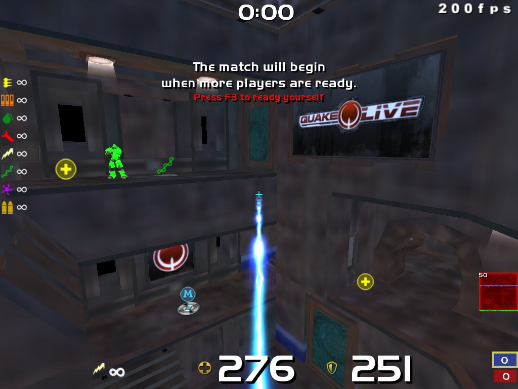
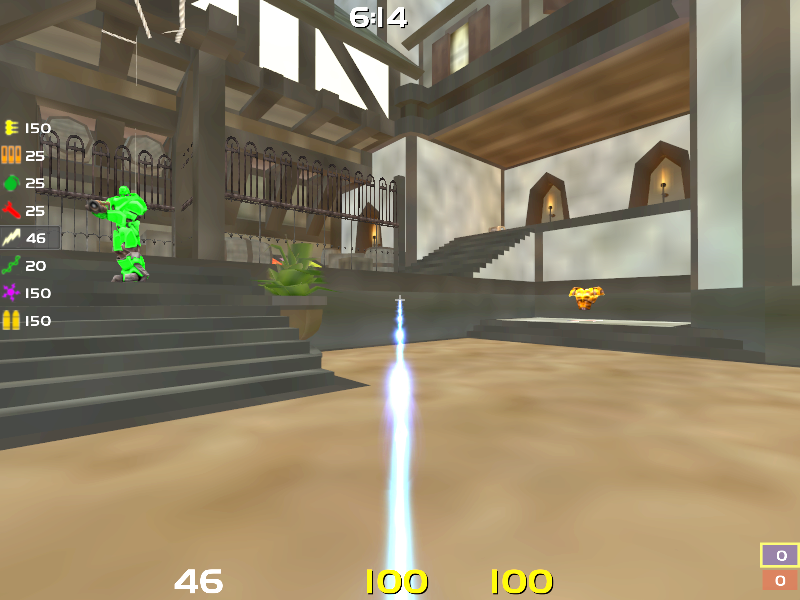
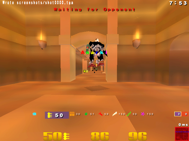
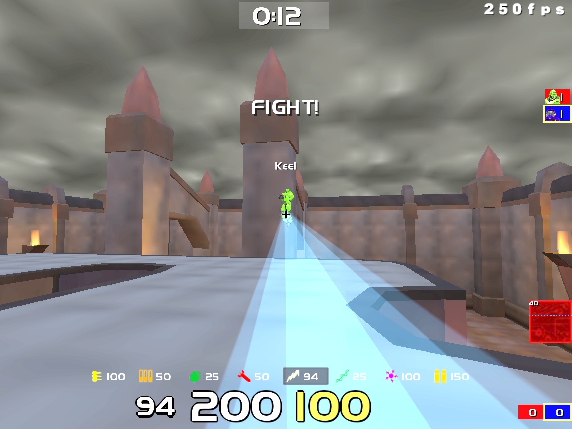
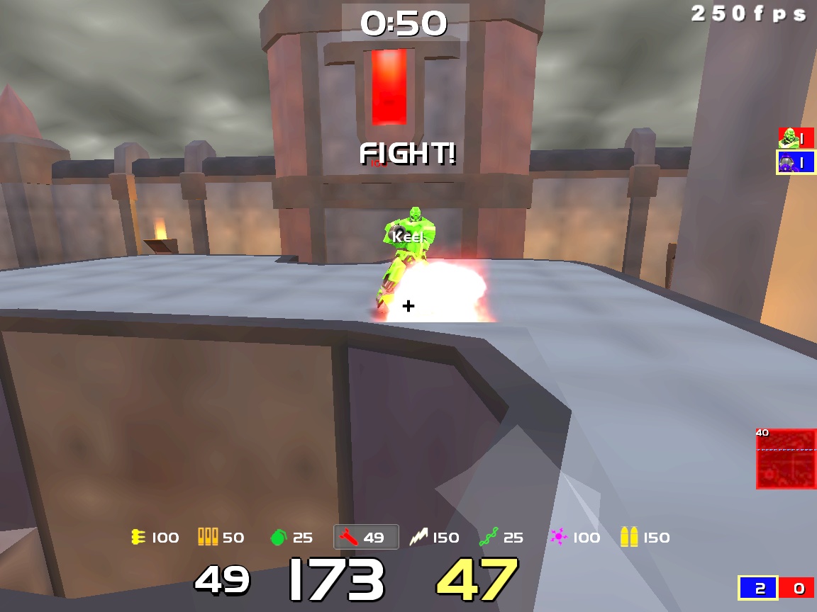
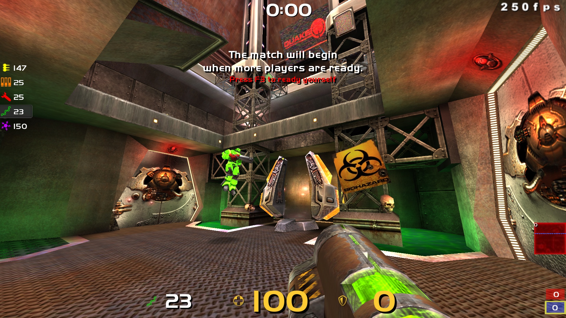
i've been playing like that for years, and so do/did a lot of people. it doesn't hide anything, having it at the bottom would mean it'd be one of lots of numbers there, not good.
you should know your ammo/health/armor without looking at the hud, so the clock is the most important number there. you also aim with your crosshair, and in case you haven't noticed: that never leaves the center of your screen ;)
Upload what exactly? :p
I don't want to upload my entire cfg, it's a total mess.
My gfx are just vertex lighting and picmip 6 and some other stuff. Aerowalk looks better with picmip 10 but not many other maps imo.
The only unordinary thing in my cfg is my shotgun crosshair: http://i6.minus.com/iAADxHjZgNnLd.jpg
:D
But I feel like it's not really doing anything so I'm gonna change it.
I made the hud with visualHUD, I could upload it if you're too lazy to make your own.. but it's probably better to make one yourself.
but imho the numbers are too small for health and armor and would be better to at least get 1 icon for the weapon's ammos (the weapon your currently using).
also i personally like the health and armor icons ;).
It's probably a 32-bit float so it would already be getting truncated. No need to exacerbate the effect by rounding! : p
I tried to work out the zoomfov algo for fun one day, but the method that made the most sense to me was k = tan(zoomfov/2) / tan(fov/2)
Injx suggested this as the third of one of his 3 options for zoom algos, but the 2nd one was chosen for QL. To get the answer of the third one I had to tinker with zoomsens a bit.
So that long number was just kind of a fun thing for me, probably doesn't help me land shots better or anything.
Lorfa, what made you change acceloffset from 5.2 to 0? and inscreasing the sense, at least compares to other cfg's of yours that I've seen. I recently found out about this command and I'm messing around with offset 4-5.5
I think because I set kind of a low sens cap so it didn't matter so much.
It's also because I'm sort of giving up on the idea of what seem like objectively 'good' settings, and instead just using settings that work with the aim motions my hand tends to make.
I've used pretty much every range of sens and accel combo imaginable, and if I have time to adapt (and want to adapt) I can play alright with just about any (reasonable) mouse setup even if I find it uncomfortable.
So the task became to make sens values that allowed me to do everything reasonably well and have it be reasonably comfortable. It sucks to have to give up on tailored settings that work great for individual weapons or activities, but that is just too much effort.
I used to just focus on the LG entirely, if I could aim well with the LG I'd deal with the rest of the stuff sucking or being uncomfortable or whatever. Now I'm just using settings that help me take my mind off the controls. Even if accuracy suffers on some weapons, general accuracy and decision making should go up some, theoretically. Shrug.
The updates and the steam release ironically took a lot of the 'steam' out of the game for me.
I mean when i use picmip 8+ with vertexlight the colors on the map are too "acid", dunno how to explain. But in your config the colors are almost as nice as with r_vertexlight 0. You use r_enablecolorscorrect 1 or something like that ? (can't remember the exact cvars)
also, is it the same for all the maps or some of the maps look shit ?
that's amazing. Seems like they fixed the maps with vertexlight.
no needs for r_mapoverbrightbits 8 r_mapoverbrightcap 145 anymore :D
i tried by myself and now it looks basically as nice as with lightmap enabled, with the default vertex settings. Except that, unlike with lightmap, it doesn't have all the ugly shadows :D, nice!
so i tried a lot of different maps, most of them look quite good with your default vertex settings appart from 1 or 2 rooms at some maps that look a bit too dark for no real reason. Or even some portions of the maps like asylum or cure that look too bright :p.
BUT some maps like stonekeep (the CTF map) look definitely too bright and somehow give eyecancer :D
so i stick to my vertex settings : r_mapoverbrightcap 145 r_mapoverbrightbits 8 and r_picmip 4 ;)
last i heard it goes up to 999. not sure if that applies to duel, most pros averages 50-60 based of demos ive seen, and i think duel t4 starts around 20-25
Lightmap, vertex and fullbright are alli set to 0.
I agree that shadows are a bit annoying but I'm not big fan of vertex light either so I set it to 0, looks sexy and doesnt affect my aim at all.
Though Im trying to get rid of them somehow but without using vertex
I played with thinner lg beam for a long time but i switched to drawgun 0 recently, i like it that way ;)
Its very simple cfg same crosshair, fov, drawgun sens for all weapons
only zoomfov is different (72 for lg and hmg, 46 for other weapons)
There is cfg and hud.
Crosshair is part of the hud, if u dont like the rest of the hud u can modify it.
* When u exec this hud on your cfg, I recommend you to use cg_crosshairsize 0, instead of cg_drawcrosshair 0 , because you can still see enemy name above crosshair with chsize 0.
cheers
LOL :D
just copy ui folder i uploaded in home/baseq3 folder where your cfg is (if you dont already have ui folder )
then type in game:
/seta cg_hudFiles ui/bog.cfg
/vid_restart
I figured it will be a rectangle box, just cba to tinker with it. )
Anyway thx, now I don't have to fuck around.
Using visualhud since the beginning but there are things I had to manually edit in the *.menu file since it lacking a bit in the visual obituaries department.
but i mean i'm too lazy to edit the hud files even tho i guess it wouldn't be too complicated considering the fact that i did my own hud back in the days in warsow :D, and also cpma ;).
but like i said i'm already pretty happy with default hud3 which is perfect imo so i don't want to start learning how to edit the hud files properly cause i simply don't want to :D