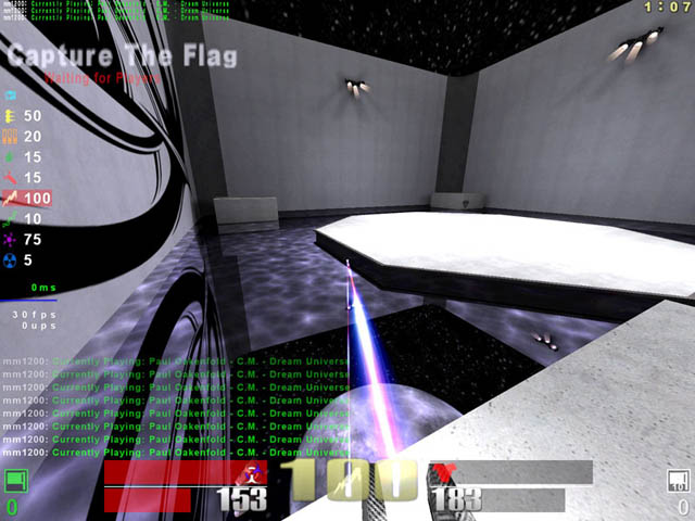
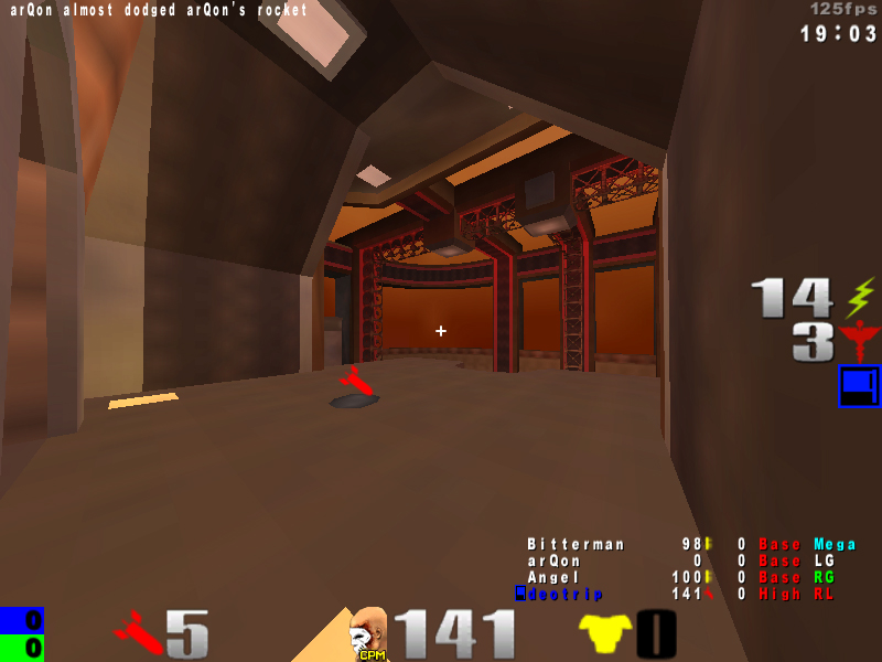
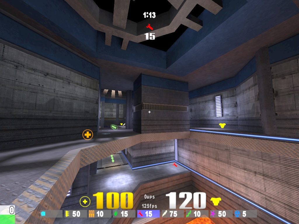
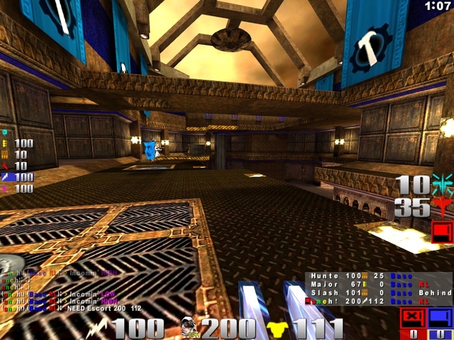
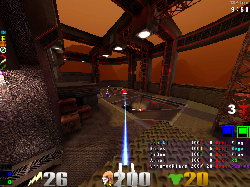
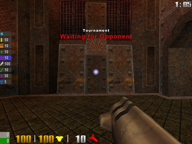
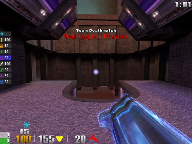
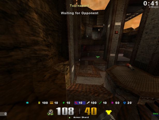
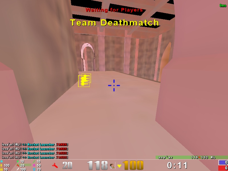
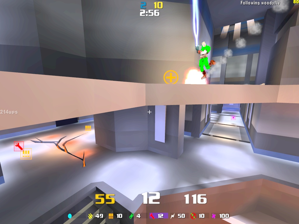
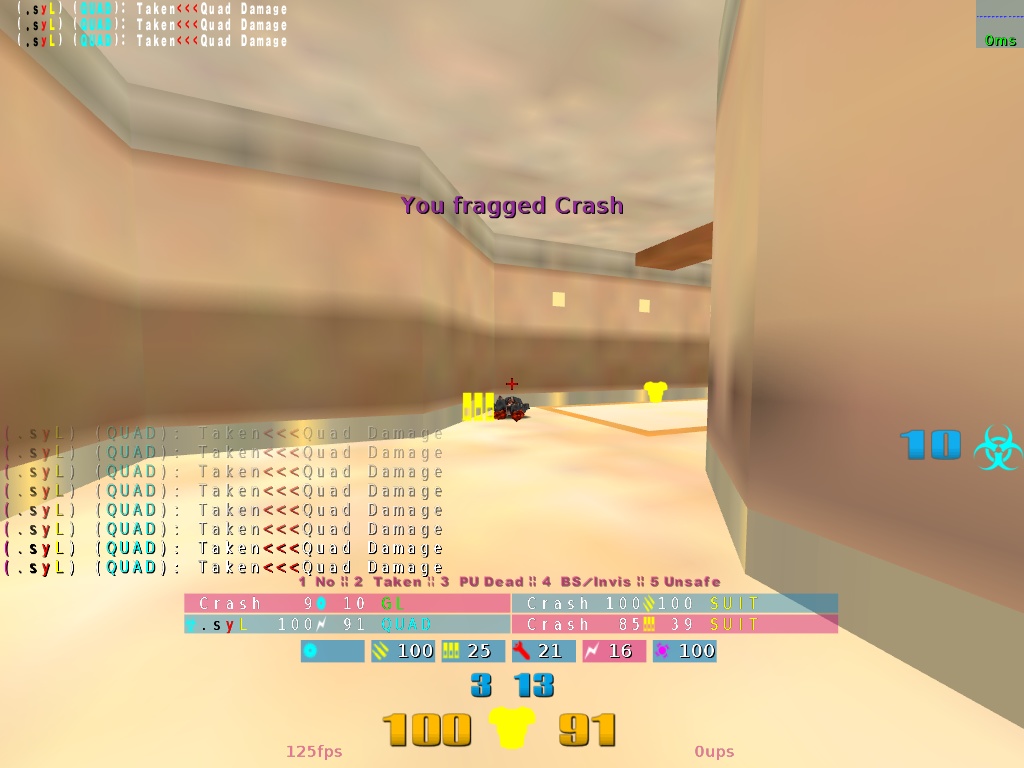
Could You move the timer, to the top right (picture), and scores to the bottom right (picture) as well ? And could You replace this ugly [hud2] bar with scores with yours?
Yeah exactly my point. I can use this. Personally I think being able to code c++ and be a top tier graphic designer in photoshop is far more powerful...
here's my new hud. wanted it to look similar to my osp hud :)
hm this is very weird! everytime i make a screenshot in cpma 1.34 with my superhud it doesnt show me the nmy & own flag status, which should be at the bottom right o_O very weird!
Yeah, I have the exact same problem. I use a similar to yours hud in osp and I wanted to make this weapon list identical to that from osp. Don't know how, so I just did something like that: http://img154.imageshack.us/img154/8648/shot0003qy5.jpg
It would be really cool if someone told me how to split this weapon list into two columns tough.
Well, I'm used to the health meter being in the center, so I don't have any problems with telling wich one is the health and wich one is the armor meter. You can't change it's color tough. It's white when it's more than 100, yellow if it's 100-34 and red if it's below 34.
just exec q3mav-net before you load a map, because the weapon and zoom script will get fucked up a little bit. The gfx and weapon+fov combinations are taken from the fox config by the way
[edit] so far ive just set this up for dueling in mind, still have to sort out the elements for ctf and tdm... although i dont play these much so ill see.
the flags and scores look really nice, don't like the rest that much as I need to have the weaponlist horizontally at the bottom, and numbers for health/armour/ammo :)
I wonder if there's a way to get the ammo bar to fill up the space depending on percentage of ammo versus max ammo instead of a set bar length per ammo count...anyone have any knowledge to crush my hopes and dreams with? =D
osp hud rebuild, 1280x800 (works fine till 800x600), 1v1/TDM/CTF included (ping shows up between ups and fps on dedicated servers), flags/scores are team coloured, own score/flag status left enemy right blablabla enjoy
Gauntlet removed from the weapon select list.
Ability to stop / control ammo going red when low.
Change size of weapon icons and font size of text, during a weapon switch.
Like cf_weaponswitch and cf_WeaponName in OSP.
Not to be a smarty pants but to that I say wouldn't the changes to the other numbers on screen make it kinda clear if you picked something up or not? If health is winds up 100 higher than where it was, mega was probably picked. I've never not known if I had picked something up or not because of other sounds going on.
But then again I play CPM and you don't have leaping over items bullshit.
I only took mine out because the person I was sharing my HUD with said he didn't need them. So I tried it and have not missed them. That means by my minimalism principle it was a good thing. But I never minded them while they were there. So yeah HUD like many things complete preference.
maybe you're in a heavy battle meanwhile, getting hit a few times, your item timing is off so you're not sure whether you picked it up during the battle or not. plenty of possible ways how it might be useful, and it happened to me a lot.
It's not very clean or organized though, and quite peculiar. Page up to enable CPM binds, insert to enable vq3 binds, home delete end and page down switch between ntf classes & bindings.