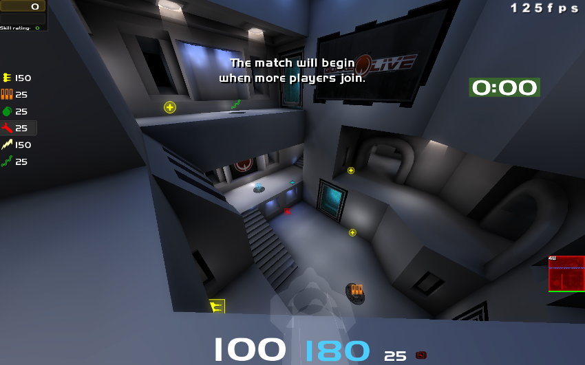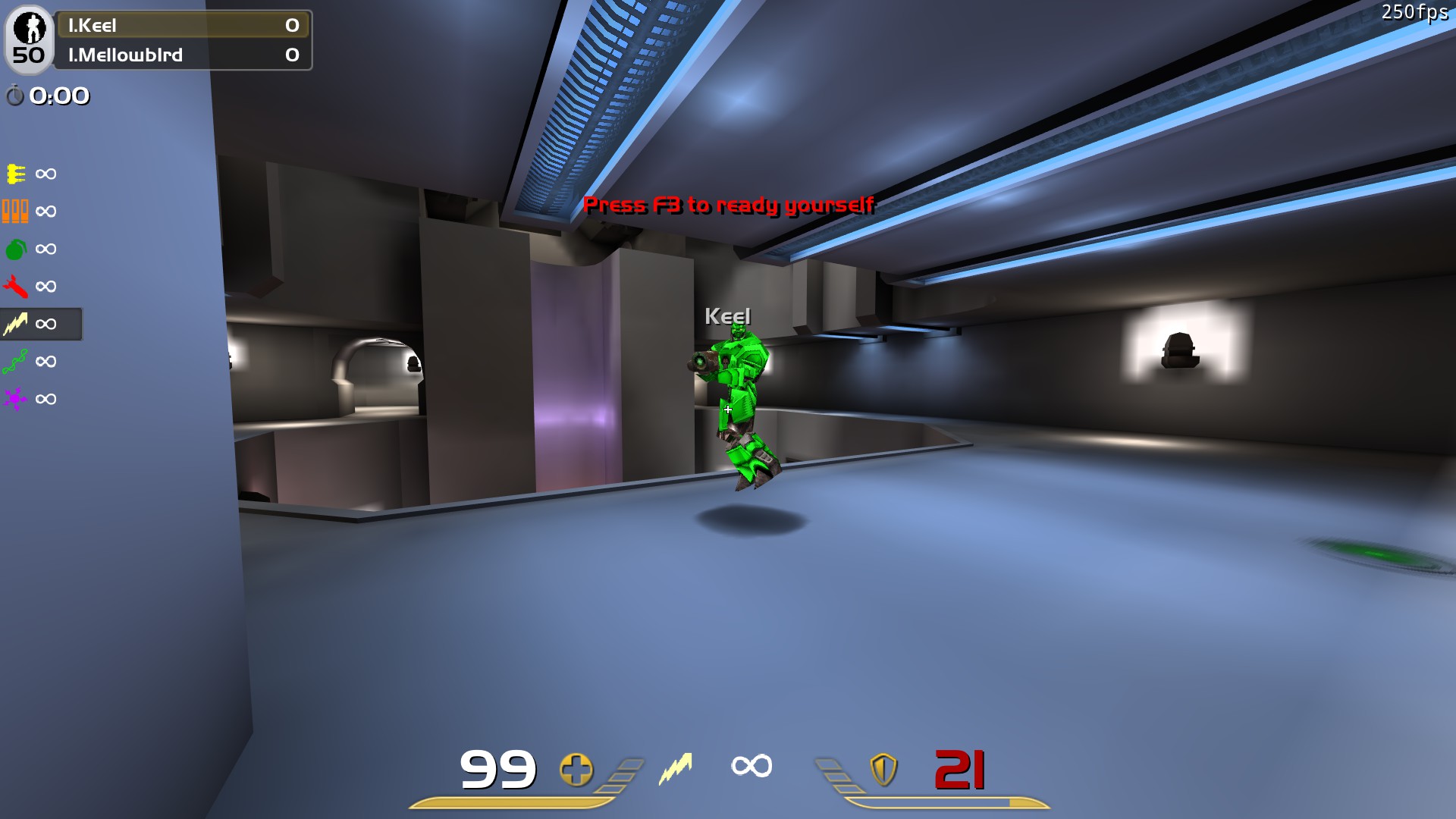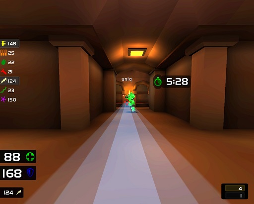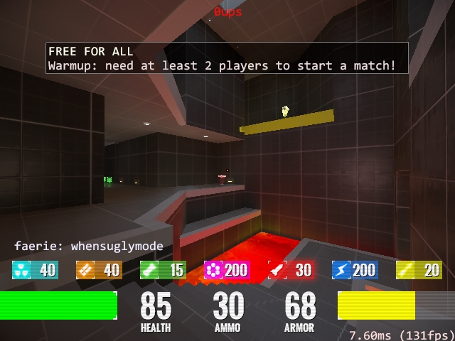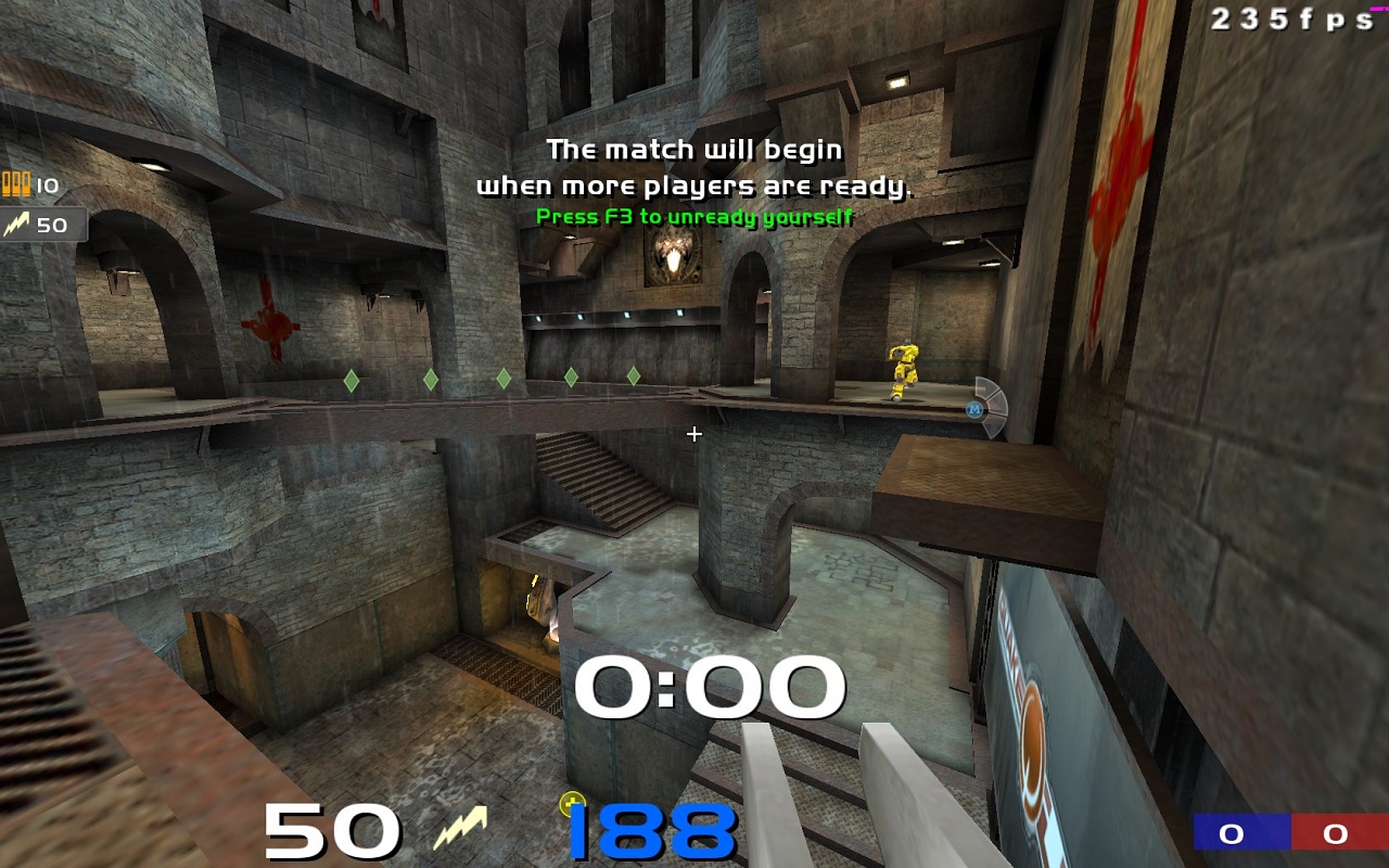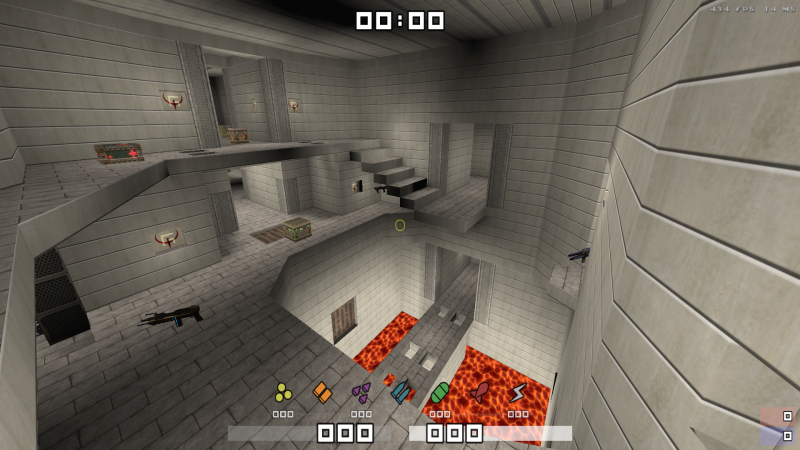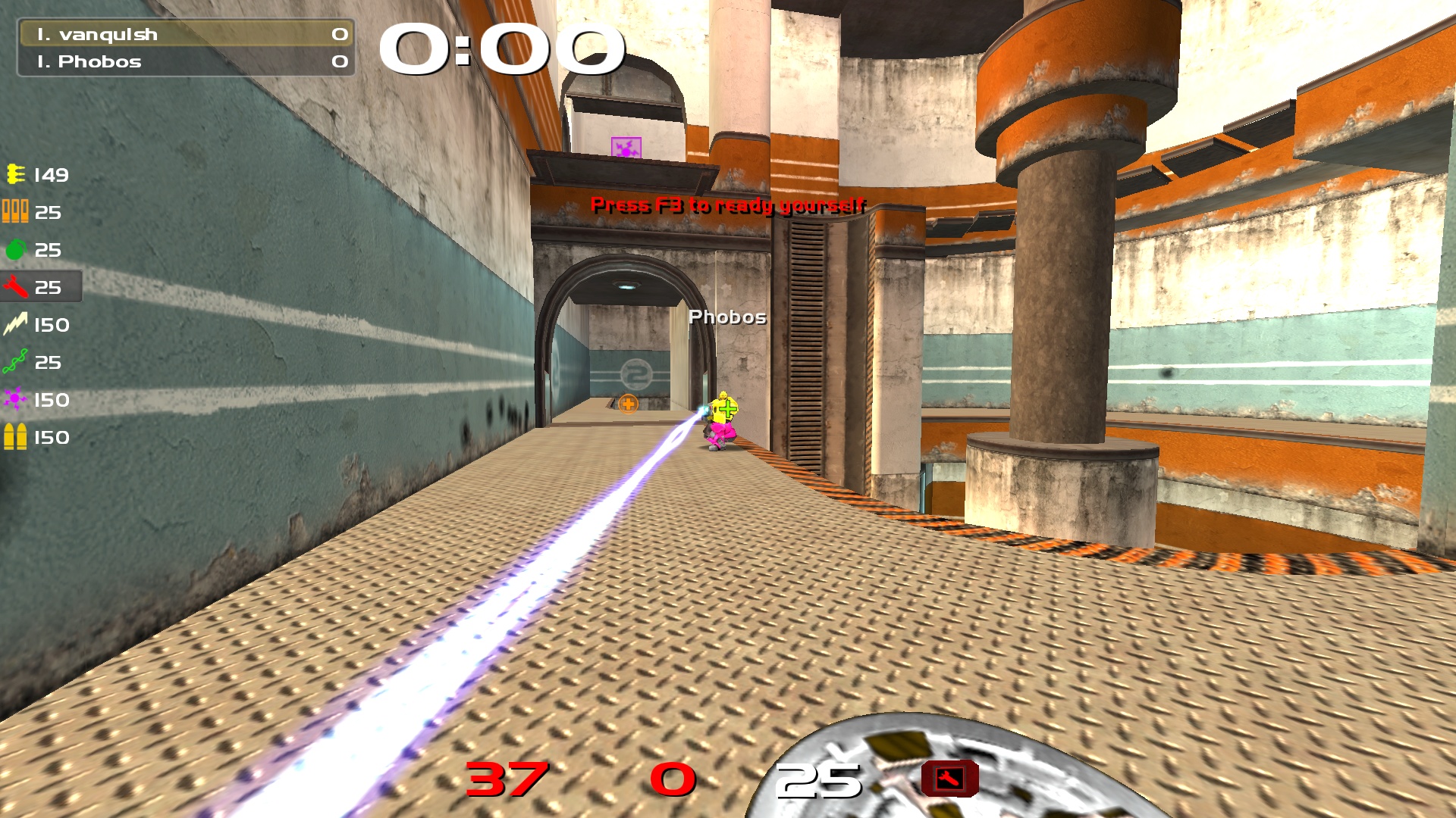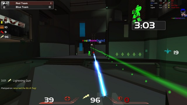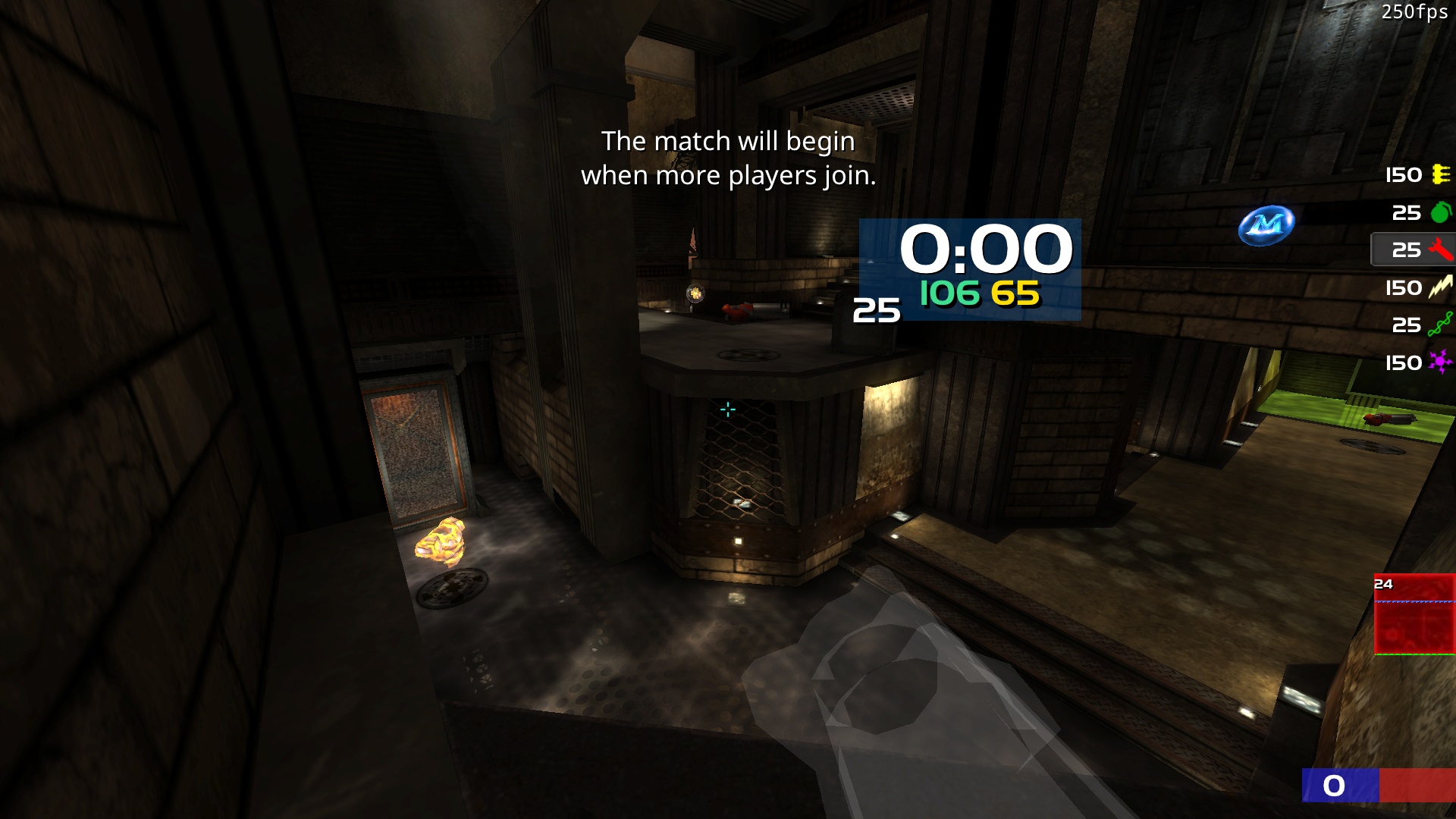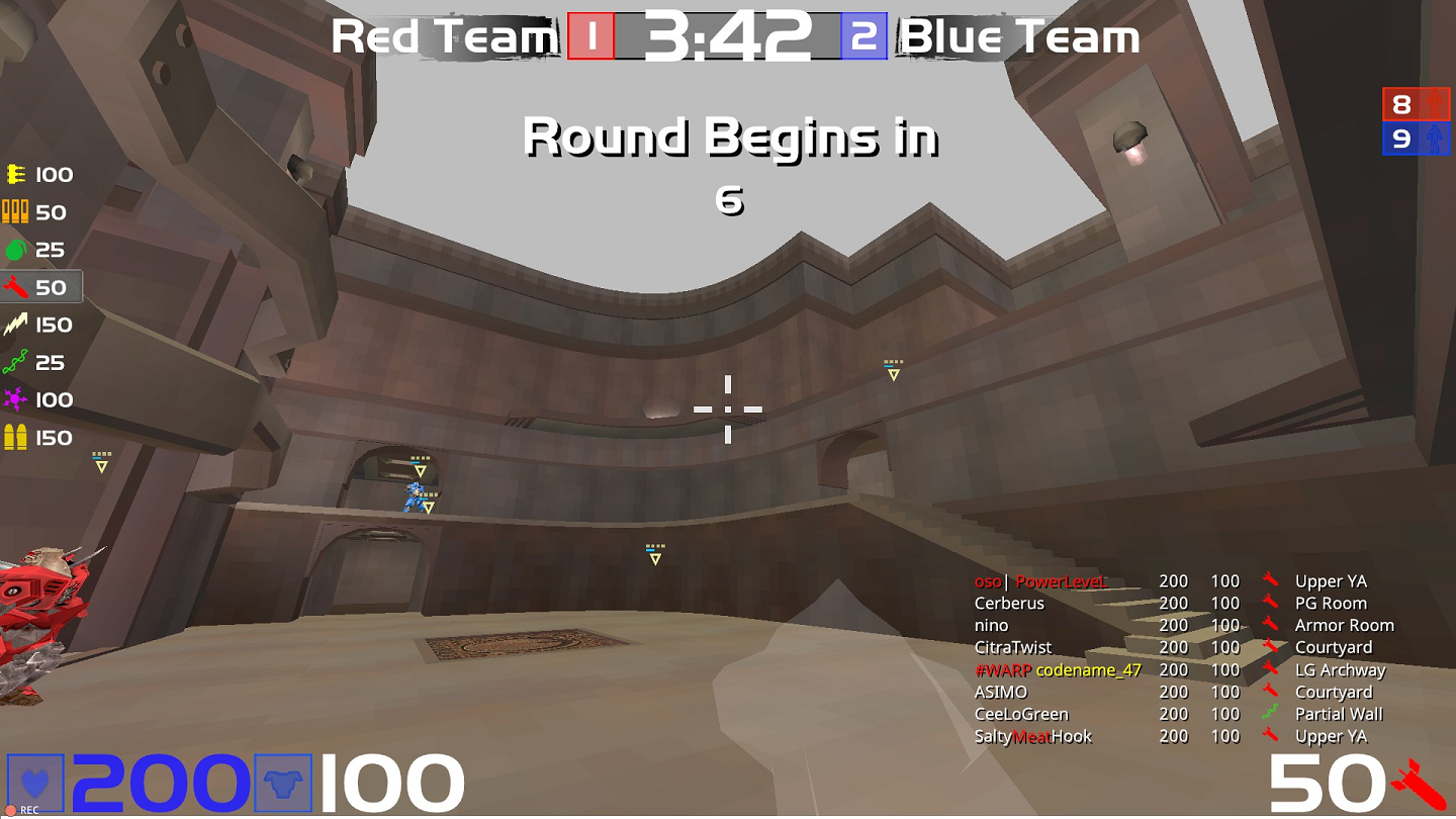
It looks realy nice, but when I tried it, I can no longer get bright enough enemy models.
I'm using Keel bright - 0x00FF00FF and he looks pretty flat and hard to spot. Not sure if there's a way to allow a brighter model without spoiling the look. Shame, cus the look is really nice. It doesn't lack depth at all, like a normal "clean" look does
Hmm...not sure about adding it as an attachment. ..http://i.imgur.com/2uocXwD.jpg Okay...There's a link at least. I dunno why every damn forum has to have a different way to post pics...lemme try one more time...http://i.imgur.com/2uocXwD.jpg
Edited by mellowb1rd at 08:16 CST, 10 December 2015
You config is awesome, i tried to tweak it like you but i run into two problems:
1. For some reason the jumppads, candles etc are also saturated and are not black n white
2. If items and nmys are far away, they loose their color and turn black n white. I tried to play with the cvars but cant find the right settings.
for 1., there are still some items which are bright anyways, I don't think you can change this. Some maps are therefore not very suited for the b/w settings. For example Cure or Silence.
I just tried 2. on cliffside, and I can't reproduce that.
Configging is half the fun for me, I fucking love just messing around with different commands and finding little ways to tweak the game. Like check out this nutty LG config I came up with:
//the goods
set lefty "cg_guny 20"
set righty "cg_guny -10"
bind a "+moveleft;vstr lefty"
bind d "+moveright;vstr righty"
Basically what it does is whenever you strafe left the LG beam switches so it comes on a wide angle from the left side of the screen, and when you strafe right it switches to coming from the far right side of the screen... 20 and -10 are the max values for cg_guny which gives you the max angles but if you want to make it less extreme just use smaller numbers...
Lemme know if you try it out! I might actually make a little youtube video about it :D
Usually a picmip 3 config, but recently i switched to 1.
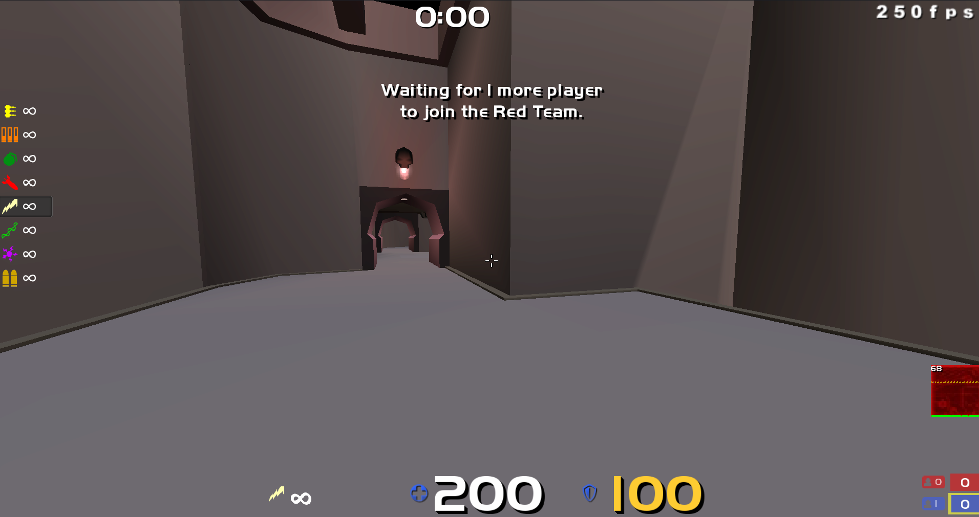
Tried to switch back but somehow feels like i need glasses, so i'll stick to it.
(nYmPhets HUD)
Edited by acid_reptile at 09:47 CST, 5 February 2015
Basically the same as last year, but I've turned shadows on. I still can't decide between black and white xhair, and my sensitivity actually feels different between the two to me. I seem to hit better with black, but white is easier on my eyes so I'm trying to swap over.
bruh this hud is killerrr, thanks
but i find that the ammo/health/armor numbers are stretched when i play in 1920x1080 (16:9)
how can i fix this / make them narrower?
I play on 1200x800 (16:10) and it looks fine. I think what u can do is go to http://visualhud.pk69.com/ and load up the sp2.vhud file and it'll recreate the hud for you to edit as u please. then you can stretch it or narrow it and re-download and hope it works on that 16:9. I play on 16:10 and it looks okay (at least not something that I noticed)
Tweaked sleepii's hud a little, may be of use to you.
- more compact hud info
- moved ammo count to centre as I play with cg_drawgun 2
- colored >100 armor range
- moved clock lower right
- moved flag and medkit icons onto left side of hud bar for ctf
hah I did a rework too, added flagindicator to the left of the hp as well. do u think tho that the black bar at the bottom gets in the way at all? at first when I tried it, it definitely felt weird. maybe my res is just low (1200x800)
All new huds feel a little strange at first I guess, but I adjusted to this quite quickly. I reduced the height of the black bar at the bottom slightly. Think it has a clean look, don't find that it obscures my fov at all. I play at 1280x720 on 16:10 crt.
yeah, it was r_picmip 6 and r_subdivisions 80+. i think, tbh, it was more subdivisions 80+ which caused the transparent effect. commonly seen on DM6/Campgrounds, heading towards pillar area, from RL.
r_lodbias also changes the size of the characters, so keep that in mind. I like tankjr with 2 or 1 but keel might get a little thin, try it for yourself.